> ## Documentation Index
> Fetch the complete documentation index at: https://docs.frontic.com/llms.txt
> Use this file to discover all available pages before exploring further.
# Search Listings
A Search Listing returns collections of items — product grids, article archives, search results — with filtering, sorting, full-text search, pagination, and facets built in. Each item in the collection is shaped like a [Detail Block](/api-builder/blocks).
Manage your listings in the [API Builder](https://app.frontic.com/builder/listings) section of the admin app.
 ## Create a listing
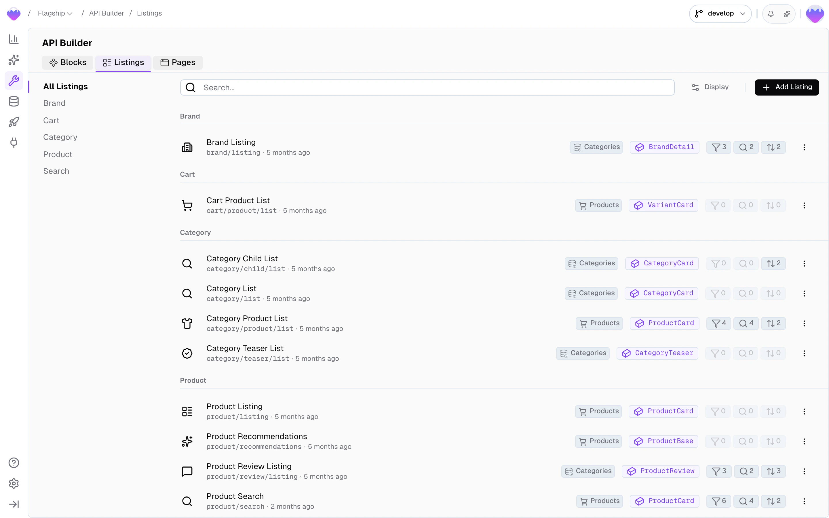
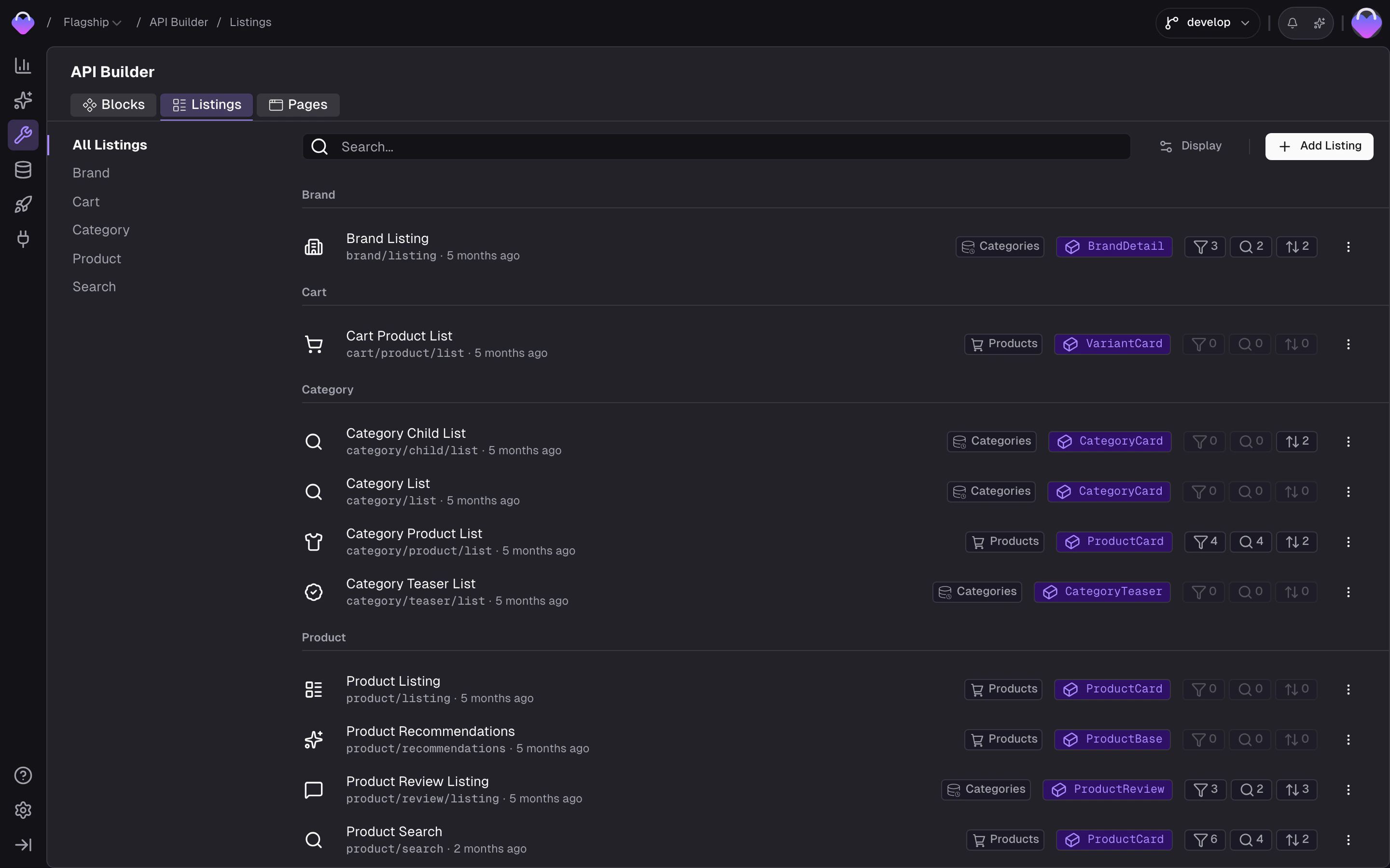
Head to the [API Builder](https://app.frontic.com/builder/listings) and click ** Add Listing**.
## Create a listing
Head to the [API Builder](https://app.frontic.com/builder/listings) and click ** Add Listing**.
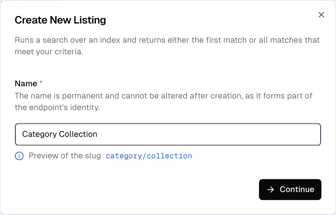
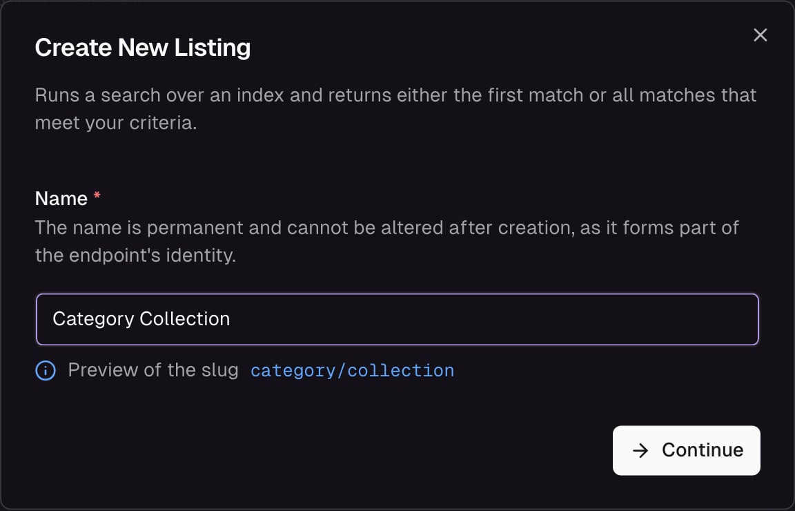 Frontic generates an endpoint URL as you type the name.
Listing names must use normal capitalized words with spaces (e.g., `Product Listing`, not `ProductListing`). Frontic derives the namespace and endpoint slug from this value — incorrect casing will break the auto-generated endpoint.
After the listing is created, configure it in the **Settings** and **Query** tabs — pick the [Detail Block](/api-builder/blocks) that shapes each item, define input parameters, and set up filters, sort options, full-text search, and pagination.
## Listing Settings
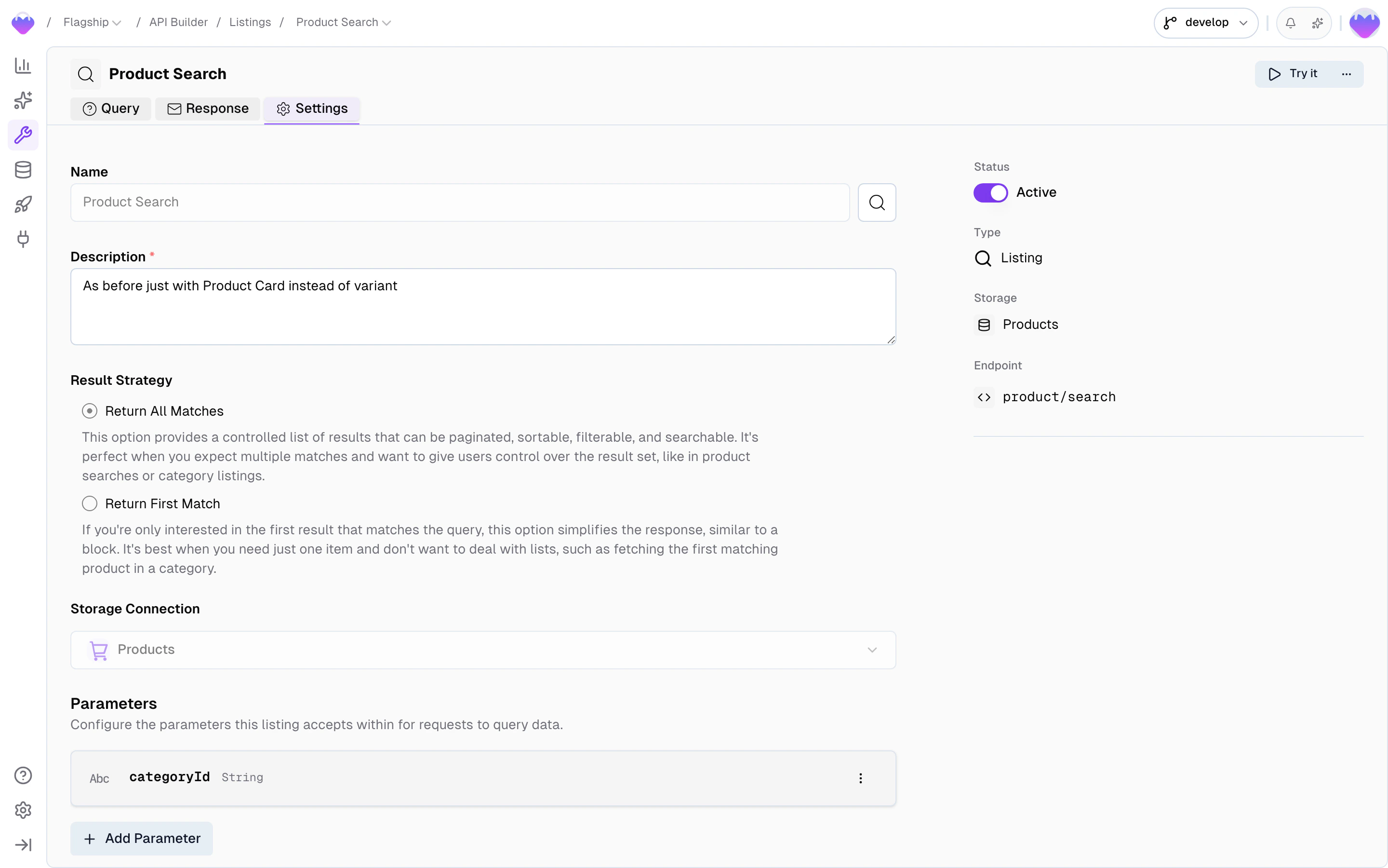
The **Settings** tab covers what the listing accepts as input, how results are returned, and which storage it reads from.
Frontic generates an endpoint URL as you type the name.
Listing names must use normal capitalized words with spaces (e.g., `Product Listing`, not `ProductListing`). Frontic derives the namespace and endpoint slug from this value — incorrect casing will break the auto-generated endpoint.
After the listing is created, configure it in the **Settings** and **Query** tabs — pick the [Detail Block](/api-builder/blocks) that shapes each item, define input parameters, and set up filters, sort options, full-text search, and pagination.
## Listing Settings
The **Settings** tab covers what the listing accepts as input, how results are returned, and which storage it reads from.
 ### Input Parameters
Parameters let you scope a listing to a specific subset — for example, fetching products in a specific category. Parameters can be strings (a category ID) or arrays (a list of product IDs).
In the **Base Query** card inside the **Query** tab, map parameters to query criteria that filter the results.
Parameters are typically controlled by the frontend based on context (the current category, the current brand), while query options (search, filters, sorting, pagination) are controlled by the user. This separation keeps the core content gated while letting users refine results.
### Result Strategy
When the connected storage is a commerce storage, choose which level the listing returns:
* **Product level** — one row per product. Returns shared fields (name, description, brand, categories). Variant-specific data is derived via the connected block's Price, Variant Field, and Variant List fields. Use for category grids, search results, and product cards.
* **Variant level** — one row per variant. Returns variant fields (price, options, SKU, stock) plus the inherited shared fields. Use for cart line items, wishlist rows, and variant pickers.
See [Product Models](/commerce-concepts/product-models#product-level-vs-variant-level-blocks) for the full picture.
### Storage
The listing reads from a connected [Data Storage](/data-integration/data-storages). The Result Strategy above selects which level of that storage drives the rows.
## Query Settings
The **Query** tab controls how the listing can be filtered, searched, sorted, and paginated.
### Input Parameters
Parameters let you scope a listing to a specific subset — for example, fetching products in a specific category. Parameters can be strings (a category ID) or arrays (a list of product IDs).
In the **Base Query** card inside the **Query** tab, map parameters to query criteria that filter the results.
Parameters are typically controlled by the frontend based on context (the current category, the current brand), while query options (search, filters, sorting, pagination) are controlled by the user. This separation keeps the core content gated while letting users refine results.
### Result Strategy
When the connected storage is a commerce storage, choose which level the listing returns:
* **Product level** — one row per product. Returns shared fields (name, description, brand, categories). Variant-specific data is derived via the connected block's Price, Variant Field, and Variant List fields. Use for category grids, search results, and product cards.
* **Variant level** — one row per variant. Returns variant fields (price, options, SKU, stock) plus the inherited shared fields. Use for cart line items, wishlist rows, and variant pickers.
See [Product Models](/commerce-concepts/product-models#product-level-vs-variant-level-blocks) for the full picture.
### Storage
The listing reads from a connected [Data Storage](/data-integration/data-storages). The Result Strategy above selects which level of that storage drives the rows.
## Query Settings
The **Query** tab controls how the listing can be filtered, searched, sorted, and paginated.
 ### Base query
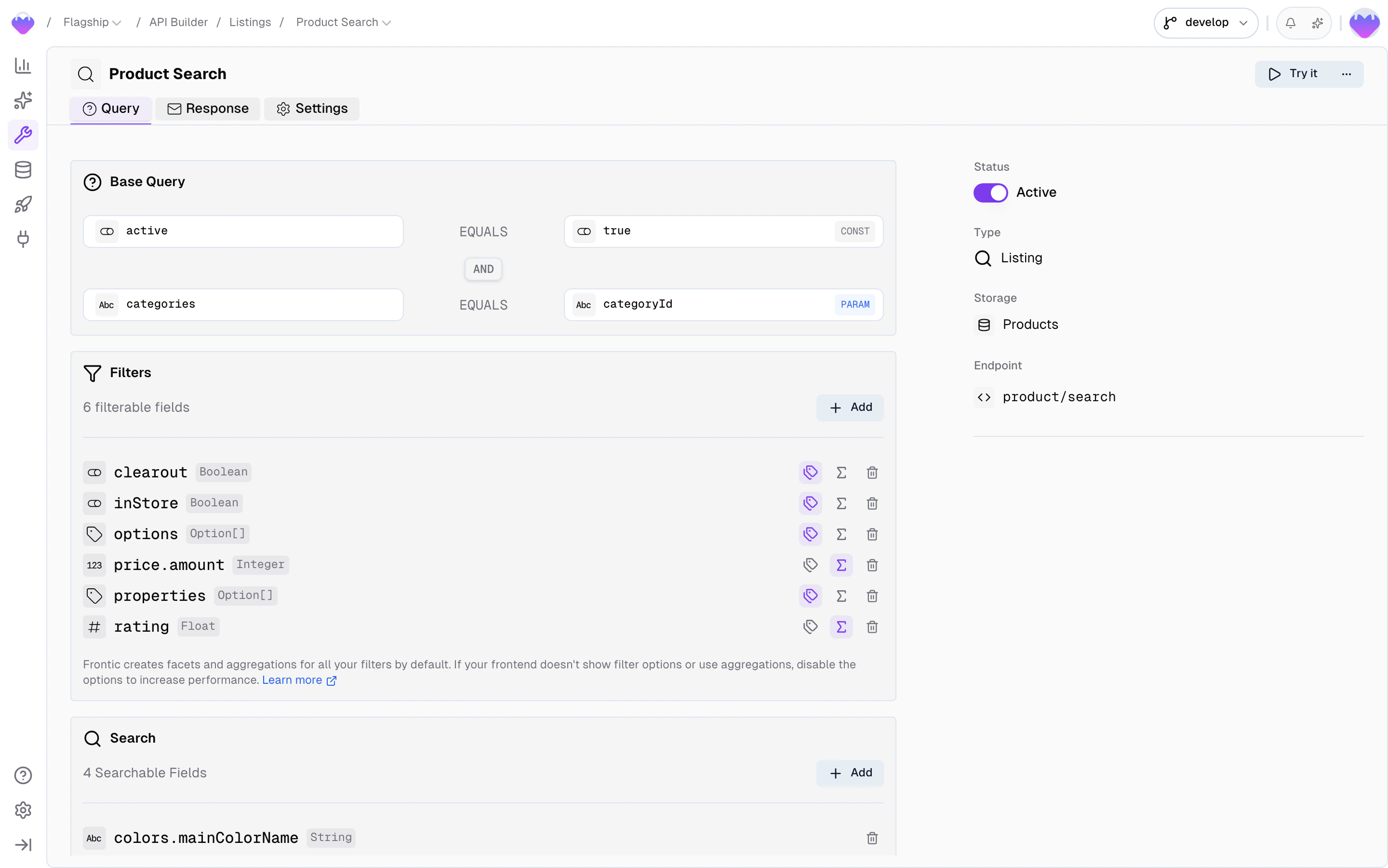
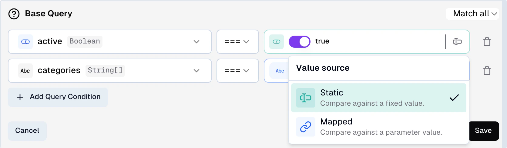
A pre-defined query that always applies to the listing — every request runs through these conditions before user filters are applied. Use it to scope the listing to a subset of records (e.g. only active products, only items in a specific category).
Each condition has three parts:
* **Field** — a storage field or [block field](/api-builder/blocks) to match against. The value input adapts to the field's type, so booleans, numbers, strings, and enums all get the right widget.
* **Operator** — how to compare. Available operators:
* `equals` / `notEquals` — exact match. Works on both string and array fields — on arrays, Frontic turns it into an "includes" check under the hood. This is the operator to use when matching against a field that holds a list of values (e.g. category IDs).
* `like` / `notLike` — partial match (contains)
* `gt` / `gte` / `lt` / `lte` — numeric comparisons
* **Value** — a static value or a [mapped parameter](#input-parameters), set via the source toggle on the right of the input:
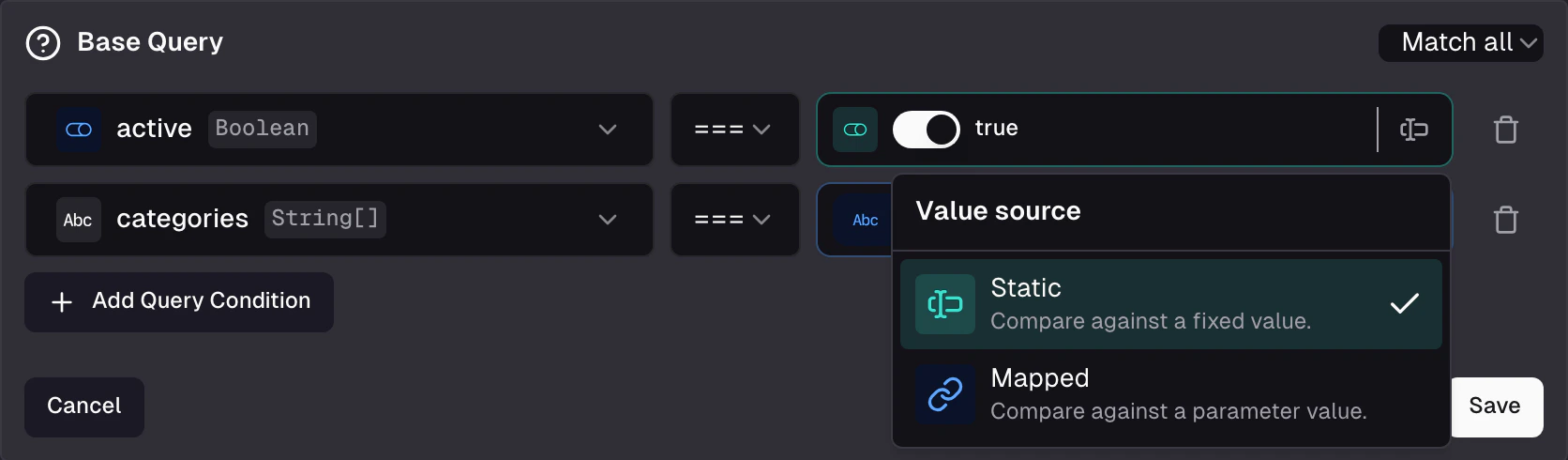
* **Static** — compare against a fixed value. The widget matches the field type: a switch for booleans, a number input for integers and floats, a dropdown for enums, a text input for everything else.
* **Mapped** — compare against an input parameter. The picker only lists parameters whose type matches the field. If exactly one matches, it's selected automatically. If none match, the picker is disabled with a "No matching parameter" hint.
Changing the field afterwards clears the value and resets the operator, so a condition can't end up with a value type that doesn't match the field.
You can add multiple conditions and choose whether records must match **all** of them or **any** of them.
### Base query
A pre-defined query that always applies to the listing — every request runs through these conditions before user filters are applied. Use it to scope the listing to a subset of records (e.g. only active products, only items in a specific category).
Each condition has three parts:
* **Field** — a storage field or [block field](/api-builder/blocks) to match against. The value input adapts to the field's type, so booleans, numbers, strings, and enums all get the right widget.
* **Operator** — how to compare. Available operators:
* `equals` / `notEquals` — exact match. Works on both string and array fields — on arrays, Frontic turns it into an "includes" check under the hood. This is the operator to use when matching against a field that holds a list of values (e.g. category IDs).
* `like` / `notLike` — partial match (contains)
* `gt` / `gte` / `lt` / `lte` — numeric comparisons
* **Value** — a static value or a [mapped parameter](#input-parameters), set via the source toggle on the right of the input:
* **Static** — compare against a fixed value. The widget matches the field type: a switch for booleans, a number input for integers and floats, a dropdown for enums, a text input for everything else.
* **Mapped** — compare against an input parameter. The picker only lists parameters whose type matches the field. If exactly one matches, it's selected automatically. If none match, the picker is disabled with a "No matching parameter" hint.
Changing the field afterwards clears the value and resets the operator, so a condition can't end up with a value type that doesn't match the field.
You can add multiple conditions and choose whether records must match **all** of them or **any** of them.
 ### Filter options
Filter, search, sorting, and pagination settings are configured directly in the **Query** tab below the base query.
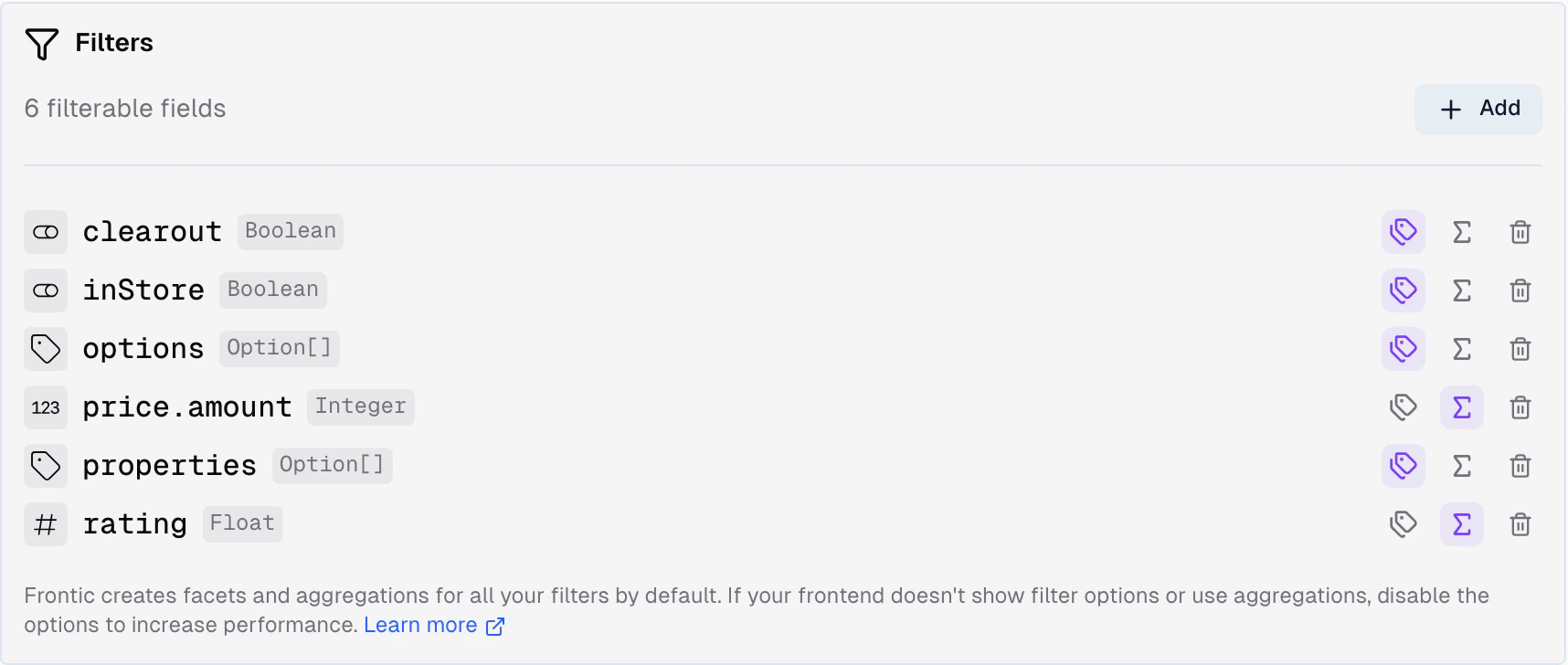
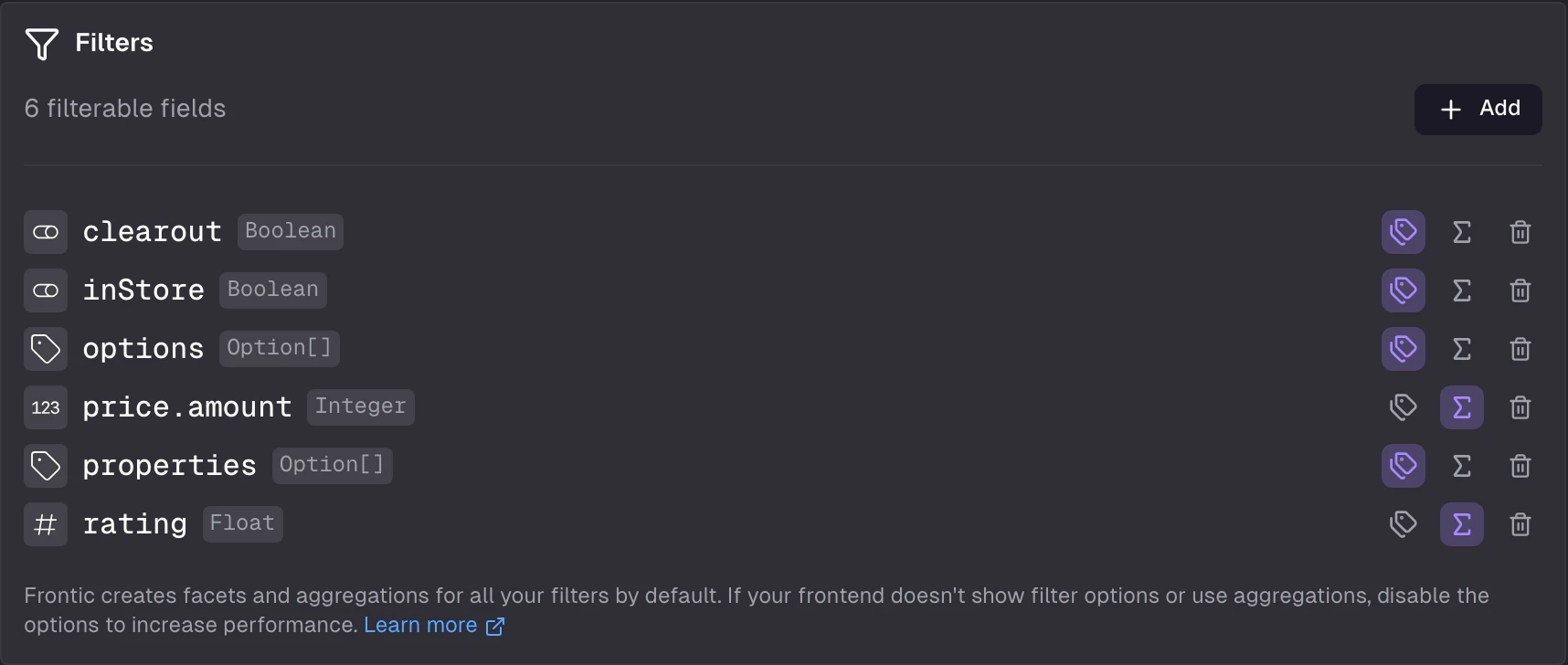
Select which fields users can filter on. Each selected field becomes a filter in the API response with facet data your frontend can render as checkboxes, dropdowns, or sliders.
* **Fields** — select from block fields or storage fields. Each selected field becomes a filterable dimension.
* **Facets** — enabled by default (up to 200 values per filter). Disable for high-cardinality fields like price ranges to reduce response size. See [Filter facets](#filter-facets) below for the response shape.
* **Active vs. total** — facets are returned in two sets: `result` (matching the current filters) and `total` (all items). Your UI can show both "X results with this filter" and "Y total items."
### Filter options
Filter, search, sorting, and pagination settings are configured directly in the **Query** tab below the base query.
Select which fields users can filter on. Each selected field becomes a filter in the API response with facet data your frontend can render as checkboxes, dropdowns, or sliders.
* **Fields** — select from block fields or storage fields. Each selected field becomes a filterable dimension.
* **Facets** — enabled by default (up to 200 values per filter). Disable for high-cardinality fields like price ranges to reduce response size. See [Filter facets](#filter-facets) below for the response shape.
* **Active vs. total** — facets are returned in two sets: `result` (matching the current filters) and `total` (all items). Your UI can show both "X results with this filter" and "Y total items."
 #### Dynamic filters
When you select an [`Option` composite](/data-integration/data-storages#option-fields) as a filter, Frontic auto-generates **dynamic facets grouped by attribute**. One Option field produces separate filter groups for color, size, material, etc. — no manual setup needed. The facets are aggregated across variants, so a product-level listing shows all available options.
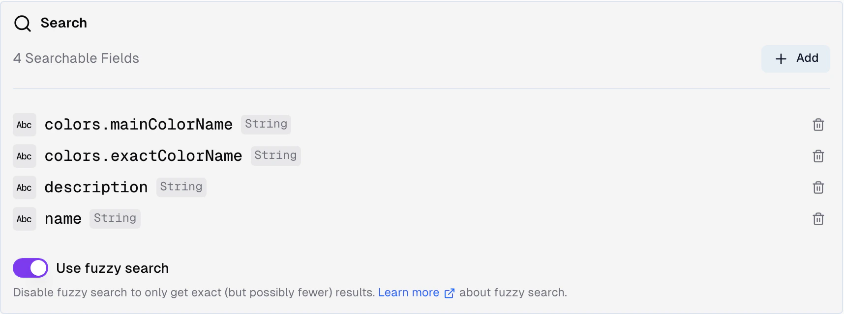
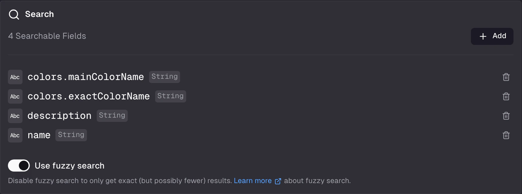
### Searchable fields
Select which fields support full-text search. Often used for product names, aliases, or descriptions.
* **Fields** — select from block fields or storage fields. Multiple fields can be searchable at once.
* **Fuzzy matching** — enabled by default to counteract typos. Disable for exact matches only.
#### Dynamic filters
When you select an [`Option` composite](/data-integration/data-storages#option-fields) as a filter, Frontic auto-generates **dynamic facets grouped by attribute**. One Option field produces separate filter groups for color, size, material, etc. — no manual setup needed. The facets are aggregated across variants, so a product-level listing shows all available options.
### Searchable fields
Select which fields support full-text search. Often used for product names, aliases, or descriptions.
* **Fields** — select from block fields or storage fields. Multiple fields can be searchable at once.
* **Fuzzy matching** — enabled by default to counteract typos. Disable for exact matches only.
 ### Sorting
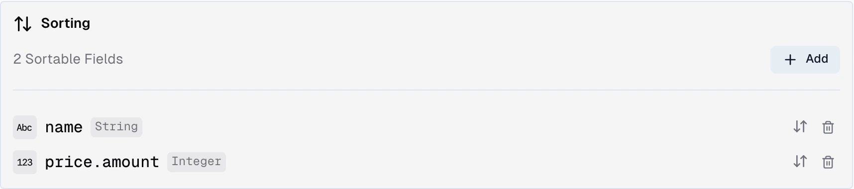
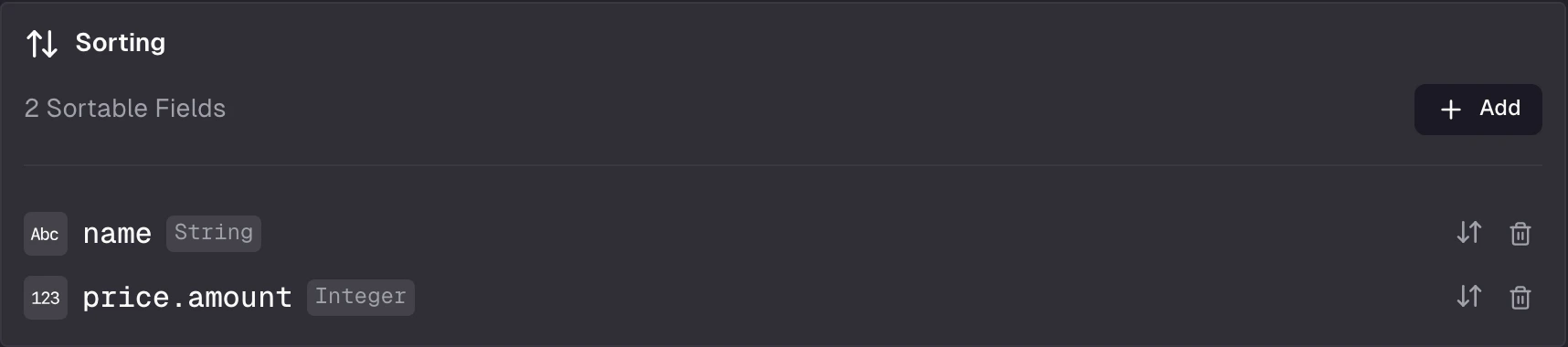
Define which fields users can sort by.
* **Sort fields** — select from block fields or storage fields
* **Default sort** — which field and direction (ascending/descending) to use when no sort is specified
* **Multiple options** — users can choose between up to 3 sort options
### Sorting
Define which fields users can sort by.
* **Sort fields** — select from block fields or storage fields
* **Default sort** — which field and direction (ascending/descending) to use when no sort is specified
* **Multiple options** — users can choose between up to 3 sort options
 #### Dynamic sortings
For category-specific product positioning or other parameterized sort orders, use the built-in "Sorting" data type in your storage. When you add it as a sort option, Frontic asks you to select a parameter whose value matches the key inside your sorting structure. Missing keys are handled gracefully.
Sorting keys (and the parameter) must be strings.
### Pagination
* **Default page size** — how many items per page when no limit is specified
* **Maximum page size** — the upper bound for the `limit` parameter
#### Dynamic sortings
For category-specific product positioning or other parameterized sort orders, use the built-in "Sorting" data type in your storage. When you add it as a sort option, Frontic asks you to select a parameter whose value matches the key inside your sorting structure. Missing keys are handled gracefully.
Sorting keys (and the parameter) must be strings.
### Pagination
* **Default page size** — how many items per page when no limit is specified
* **Maximum page size** — the upper bound for the `limit` parameter

 ## Fetch a listing
The minimal call takes the listing name and its parameters:
```ts theme={"theme":"css-variables"}
const { items } = await client.listing("ProductListing", {
categoryId: "shoes",
});
```
```vue theme={"theme":"css-variables"}
```
Add a `query` object to filter, sort, search, and paginate. Filters support `equals`, `range`, `contains`, and `and` / `or` / `not` for chaining — by default they're AND-combined. Passing an array of values to `equals` or `contains` is treated as an OR group.
```ts theme={"theme":"css-variables"}
const { items } = await client.listing(
"ProductListing",
{ categoryId: "shoes" },
{
query: {
filter: [
{ field: "price.amount", type: "range", from: 3000, to: 10000 },
{
type: "or",
filter: [
{ field: "properties.activity", type: "equals", value: "Running" },
{ field: "properties.activity", type: "equals", value: "Cycling" },
],
},
],
sort: { field: "publishedAt", order: "desc" },
search: "trail",
page: 1,
limit: 24,
},
},
);
```
```vue theme={"theme":"css-variables"}
```
For interactive search UIs, [`useFronticSearch`](/reference/nuxt-module#usefronticsearch) wraps `useFronticListing` with reactive state and ready-to-use methods for adding/removing filters, sorting, paginating, searching, and resetting state.
See the [Client SDK reference](/reference/client-sdk#client-listing) and [Nuxt module reference](/reference/nuxt-module#usefronticlisting) for the full API surface, including all filter operators and per-request overrides.
## Response
The response contains items and metadata for building your UI.
```json theme={"theme":"css-variables"}
{
"items": [],
"total": 998,
"page": {
"last": 42,
"limit": 24,
"current": 1,
"next": null,
"prev": null
},
"filter": {},
"aggregation": {},
"sort": []
}
```
The resulting items, each shaped like the connected Detail Block.
Total number of items matching the query.
Current page information: `current`, `last`, `limit`, `next`, `prev`.
Facet data for each configured filter field.
Aggregation results (min, max, avg, sum, total) for configured filter fields.
Configured sorting options (up to 3).
### Filter facets
Each entry under `filter` describes one filter's available options under the current query. Every option carries `option`, `value`, `count`, `selected`, and `disabled` — enough for your UI to render checkboxes, dropdowns, or sliders without extra requests.
```json theme={"theme":"css-variables"}
{
"filter": {
"activity": [
{ "option": "Running", "value": "Running", "selected": true, "count": 42, "disabled": false },
{ "option": "Cycling", "value": "Cycling", "selected": false, "count": null, "disabled": false }
]
}
}
```
By default, filters are AND-combined and `count` / `disabled` reflect that assumption. When a filter is applied as an OR group, only selected options get a real count — non-selected options return `count: null` so your UI can keep them selectable without showing a misleading number.
### Aggregations
For each filter field, `aggregation` returns `result` (matching the current query) and `total` (across all items). Numeric fields include `min`, `max`, `avg`, `sum`, `total`; string fields include only `total`. Disable aggregations on individual filter fields to reduce response size.
## API Playground
Preview — the API Playground is in early access. It runs against your live backend today, but the UI and feature set are still settling before general availability. [Reach out](mailto:support@frontic.com) if you want to try it.
Open the playground from any listing's detail page to test queries against real data without writing code. The listing playground gives you a full visual interface for the query layer.
## Fetch a listing
The minimal call takes the listing name and its parameters:
```ts theme={"theme":"css-variables"}
const { items } = await client.listing("ProductListing", {
categoryId: "shoes",
});
```
```vue theme={"theme":"css-variables"}
```
Add a `query` object to filter, sort, search, and paginate. Filters support `equals`, `range`, `contains`, and `and` / `or` / `not` for chaining — by default they're AND-combined. Passing an array of values to `equals` or `contains` is treated as an OR group.
```ts theme={"theme":"css-variables"}
const { items } = await client.listing(
"ProductListing",
{ categoryId: "shoes" },
{
query: {
filter: [
{ field: "price.amount", type: "range", from: 3000, to: 10000 },
{
type: "or",
filter: [
{ field: "properties.activity", type: "equals", value: "Running" },
{ field: "properties.activity", type: "equals", value: "Cycling" },
],
},
],
sort: { field: "publishedAt", order: "desc" },
search: "trail",
page: 1,
limit: 24,
},
},
);
```
```vue theme={"theme":"css-variables"}
```
For interactive search UIs, [`useFronticSearch`](/reference/nuxt-module#usefronticsearch) wraps `useFronticListing` with reactive state and ready-to-use methods for adding/removing filters, sorting, paginating, searching, and resetting state.
See the [Client SDK reference](/reference/client-sdk#client-listing) and [Nuxt module reference](/reference/nuxt-module#usefronticlisting) for the full API surface, including all filter operators and per-request overrides.
## Response
The response contains items and metadata for building your UI.
```json theme={"theme":"css-variables"}
{
"items": [],
"total": 998,
"page": {
"last": 42,
"limit": 24,
"current": 1,
"next": null,
"prev": null
},
"filter": {},
"aggregation": {},
"sort": []
}
```
The resulting items, each shaped like the connected Detail Block.
Total number of items matching the query.
Current page information: `current`, `last`, `limit`, `next`, `prev`.
Facet data for each configured filter field.
Aggregation results (min, max, avg, sum, total) for configured filter fields.
Configured sorting options (up to 3).
### Filter facets
Each entry under `filter` describes one filter's available options under the current query. Every option carries `option`, `value`, `count`, `selected`, and `disabled` — enough for your UI to render checkboxes, dropdowns, or sliders without extra requests.
```json theme={"theme":"css-variables"}
{
"filter": {
"activity": [
{ "option": "Running", "value": "Running", "selected": true, "count": 42, "disabled": false },
{ "option": "Cycling", "value": "Cycling", "selected": false, "count": null, "disabled": false }
]
}
}
```
By default, filters are AND-combined and `count` / `disabled` reflect that assumption. When a filter is applied as an OR group, only selected options get a real count — non-selected options return `count: null` so your UI can keep them selectable without showing a misleading number.
### Aggregations
For each filter field, `aggregation` returns `result` (matching the current query) and `total` (across all items). Numeric fields include `min`, `max`, `avg`, `sum`, `total`; string fields include only `total`. Disable aggregations on individual filter fields to reduce response size.
## API Playground
Preview — the API Playground is in early access. It runs against your live backend today, but the UI and feature set are still settling before general availability. [Reach out](mailto:support@frontic.com) if you want to try it.
Open the playground from any listing's detail page to test queries against real data without writing code. The listing playground gives you a full visual interface for the query layer.
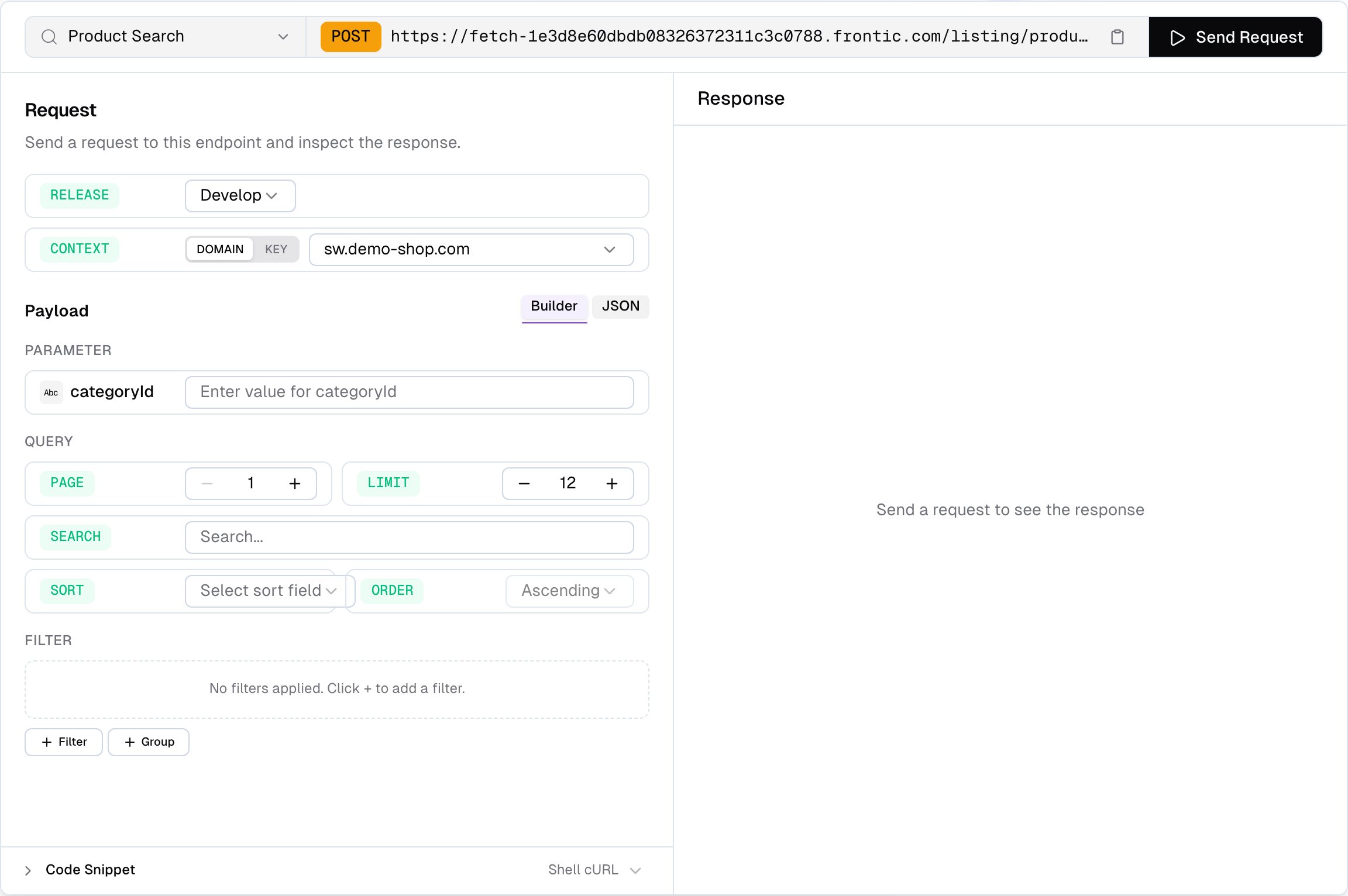
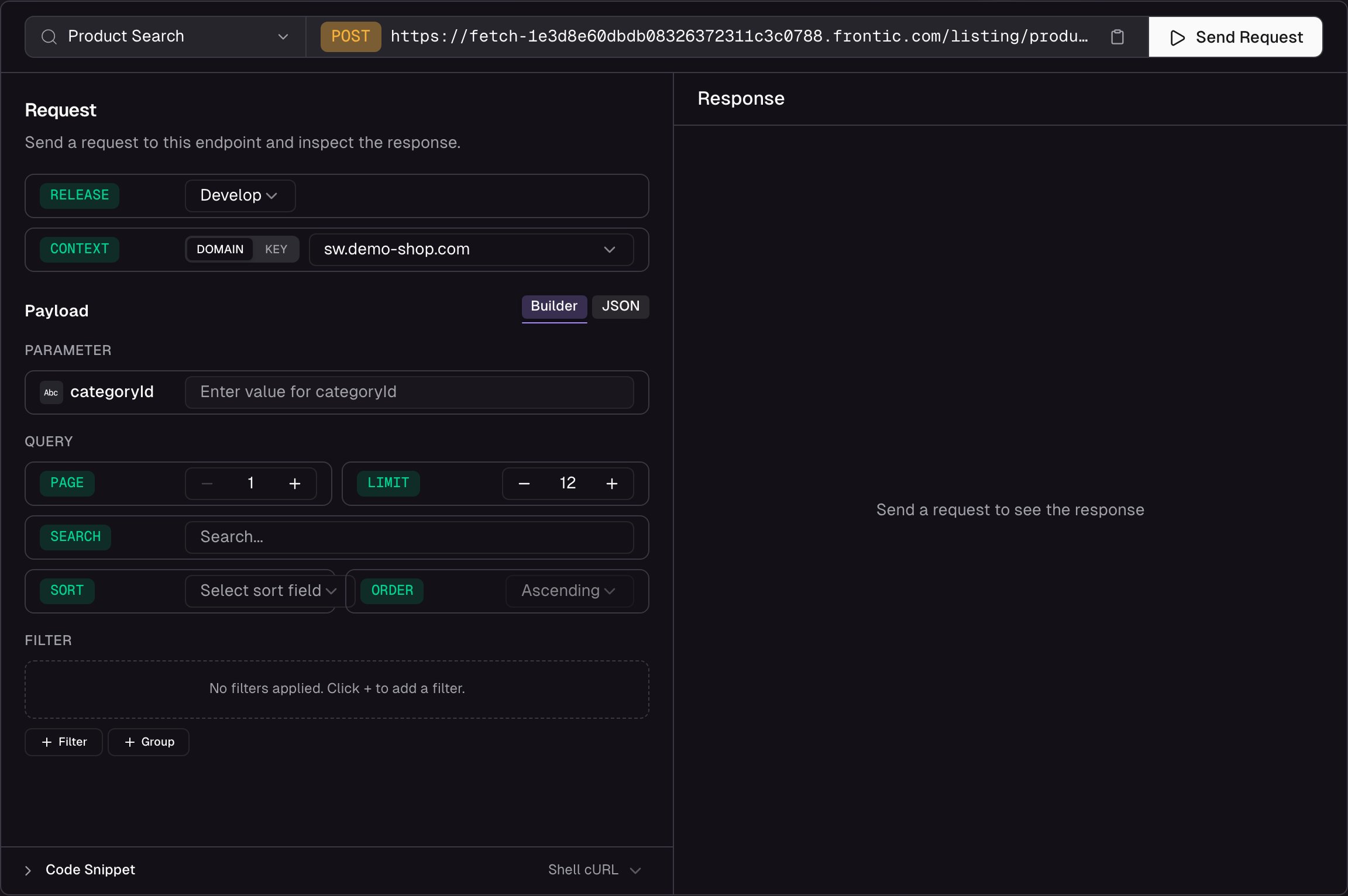 **What you can do:**
* **Fill parameters** — each listing parameter gets its own typed input field, pre-filled with defaults where available
* **Pick a release stage** — run the request against `develop`, `preview`, or `public`. Preview and public only appear when those environments exist on the project
* **Paginate** — page and limit steppers that sync with the response. If you exceed the last page, the playground auto-clamps
* **Search** — type a search query and see how your searchable fields respond
* **Sort** — pick a sort field and direction from the configured options
* **Build filters visually** — a filter builder that supports AND/OR groups matching your configured filter options. After the first request, facet values from the response are loaded into the filter inputs so you can pick from real data
* **Switch context** — pick **Domain** to send a `contextDomain` and let Frontic resolve the matching context, or **Key** to send an explicit `contextKey`
* **Inspect the response** — status, response time, and payload size are shown alongside the body so you can spot performance issues. The full JSON response is browseable and copyable
* **Copy code snippets** — auto-generated from your current configuration, ready to paste into your project
* **Edit raw JSON** — switch to the raw tab to craft custom request payloads by hand
**What you can do:**
* **Fill parameters** — each listing parameter gets its own typed input field, pre-filled with defaults where available
* **Pick a release stage** — run the request against `develop`, `preview`, or `public`. Preview and public only appear when those environments exist on the project
* **Paginate** — page and limit steppers that sync with the response. If you exceed the last page, the playground auto-clamps
* **Search** — type a search query and see how your searchable fields respond
* **Sort** — pick a sort field and direction from the configured options
* **Build filters visually** — a filter builder that supports AND/OR groups matching your configured filter options. After the first request, facet values from the response are loaded into the filter inputs so you can pick from real data
* **Switch context** — pick **Domain** to send a `contextDomain` and let Frontic resolve the matching context, or **Key** to send an explicit `contextKey`
* **Inspect the response** — status, response time, and payload size are shown alongside the body so you can spot performance issues. The full JSON response is browseable and copyable
* **Copy code snippets** — auto-generated from your current configuration, ready to paste into your project
* **Edit raw JSON** — switch to the raw tab to craft custom request payloads by hand